The problem hiding in the most-used screen.
Task detail views are among the most frequently visited surfaces in any B2B tool. They're also consistently the most cognitively expensive.
SyncUp is a modern project management web app for teams who need to organise, track, and collaborate on tasks. The challenge was to design two connected surfaces: the Task Details view — the single source of truth for any work item — and the Create Subtask flow — the core workflow where a large task is broken into smaller, assignable units.
These two surfaces are architecturally bound. You can't design subtask creation without first deciding how the parent task is structured. And you can't design the task detail view without answering: how does the user act on what they see? Most tools treat these as separate problems. That separation is precisely why they fail.
The design challenge: one surface. Two modes. Reading and acting — simultaneously, without friction.
Task detail views in most B2B tools present information uniformly — every field gets the same visual weight. But a PM doesn't scan fields uniformly. She checks status and assignees first, reads description on first visit, skims it on every return, and reads activity chronologically. The question wasn't what to show. It was in what order her brain already expected to receive it.
Before designing anything, I needed to understand exactly how existing tools fail at this — and why. So I started with the competition.
Diverge before you converge. Twice.
The whole project ran on the Double Diamond: widen to understand the problem, narrow to frame it, widen again to explore solutions, narrow again to ship one.
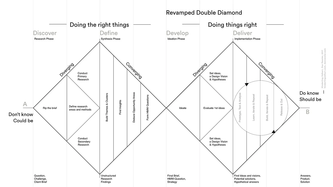
That framework only means something once it's grounded in real competitors and a real person. Here's where Discover started.
Four tools. Four failure modes. One pattern.
I audited the four tools most used by power PMs — not to copy their solutions, but to map exactly where each one breaks down.

Best-in-class information density and keyboard-first UX — the cleanest status chip pattern in the industry. But sub-issue creation is tucked behind a right-click context menu. Discoverable only by power users who already know it's there. First-time discoverability is near zero.

Highly configurable and feature-rich, but the task form reads like a form — every field gets equal visual weight regardless of how often it's actually used. Priority, sprint, story points, and tags all compete for the same attention. Cognitive load is high even on simple tasks.

The enterprise standard — but subtask creation requires: Issue menu → Create → select type "Sub-task" → fill the full form. Three clicks and a modal for what should be a lightweight decomposition action. Status lives far down a right panel, requiring a scroll every time.

Extremely flexible and visually calm, but not purpose-built for task hierarchy. Subtasks are relations to other database pages — no native parent-child dependency or completion tracking. Activity and comments feel structurally disconnected from the task itself.
Tools with the best information architecture hide the creation action (Linear). Tools that make creation visible sacrifice visual hierarchy (ClickUp). No tool resolved both simultaneously. That became the design mandate for SyncUp: a surface where reading a task and acting on it feel like the same motion, not two separate modes.
The mandate was clear. But a design mandate only becomes a design solution when it's anchored to a specific person. I needed to understand exactly who would live inside this tool every day — and what that costs her when it gets in the way.
A PM who can't afford a slow tool.
A task detail view used once is a reference document. Used twenty times a day, it's a workspace. Every design decision had to serve return visits, not first-time orientation.
- Understand a task's complete state at a glance — no hunting across the interface
- Break large tasks into subtasks without losing her place in the parent task
- Assign subtasks to teammates with minimum input (title required, rest optional)
- Track team progress through a single, unified chronological feed
- Status, assignee, and due date are scattered — she has to scan the whole view to orient herself
- Creating a subtask breaks context: new modal, too many required fields, too many clicks
- Activity and comments live in separate tabs — no single narrative of what happened
Maya's most frequent action pattern: open task → check status → scan subtasks → act. This three-step mental routine shaped everything. Status had to be the first thing she sees — before she even reads the task title. Subtask creation had to be accessible from within the subtask list itself, not a navigation action. And "act" had to require as little cognitive overhead as possible.
Her mental model — status first, description second, subtasks third, activity last — made the structural answer clear. The layout wasn't a design choice. It was a direct translation of how she already thinks.
Structure first. Visuals second.
Before touching typography or colour, I mapped every piece of content by two axes: how often Maya reads it per visit, and how urgently she needs to act on it.
That mapping produced a clear three-zone layout and a strict content order. Status and assignees sit above the fold always. Description begins just below. Subtasks follow. Activity — the most time-intensive content to read — anchors the bottom.
Counter-intuitive at first — shouldn't the task name come first? But the metadata strip answers "what state is this task in?" before Maya even reads the name. On her twentieth return visit, status + due date confirms context in under a second. The title then reads with that context already loaded. In Jira, status lives below the description — which is why PMs always feel like they're hunting for information they already know they need.
With the structure decided, the next question was: how did I actually get here? What did I explore, reject, and learn along the way?
Two principles that governed every screen.
Before locking individual decisions, I set two rules the whole system had to obey — everything downstream gets checked against these.
Those two rules shaped four specific decisions — the ones I'd defend if challenged on any alternative.
Four decisions. Four answers to "why this, not that."
Rationale is where intent becomes accountable. These are the decisions I spent the most time on — and the specific reasoning behind each one, pulled straight from the working file.



Every one of these decisions produced a set of components that needed to work across multiple states and real content lengths — here's how it all comes together in one view.
The complete picture.
Three zones, one reading order — and a subtask creation flow that doesn't interrupt the view it lives inside.
What I accepted — and where I'd go next.
Every decision closes some doors. Here's an honest account of what I traded away, and what I'd invest in with more runway.
One key realization from this was that design is not only about deciding what to include but also about knowing what to omit.
The core tension in this project wasn't visual — it was cognitive. The task detail screen has to serve two mental modes simultaneously: reading (understanding the task) and acting (changing status, adding subtasks, posting comments). Most tools handle each mode separately. The goal here was a surface where both coexist without friction — where reading flows naturally into acting without a context switch. The inline subtask input is the sharpest expression of that goal: creating something new without leaving the place where you understand it.